Pupil Dilation and Cognitive Load: Usability Testing Innovations
We test websites because it’s still the best way to directly collect users’ point of view. It’s often the only way organizations can see how people actually use their website. For that alone, usability testing is essential, even in its simplest form.
Website testing, also known as usability testing, keeps getting better and better. Modern methodology and technology make usability testing more objective and precise than ever. We can now measure attention, attraction and arousal to better understand how users interact with a website. We can also track something we haven’t discussed much in our blog until now: cognitive load.
Cognitive load is the perceived amount of effort needed to successfully complete a task on a website (adapted from Jung et al. 2011). Put simply, a larger cognitive load results in increased rates of failure. Obviously, we want to minimize cognitive load. To achieve that, we must know where and when cognitive load is high on the website.
There’s many ways to measure cognitive load: surveys, heart rate monitoring, electroencephalography, etc. Sounds fancy, doesn’t it? At imarklab, we also use the simpler pupil dilation. It has many advantages compared to the other alternatives.
- Non-invasive : no device needs to be placed on the users and nothing restricts their movements.
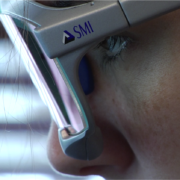
- Can be collected by the eye trackers we already use.
- Can be combined with eye tracking data to locate precisely what area of the screen generates high cognitive load. This can’t be underestimated –that information is necessary to improve the interface.
How It Works
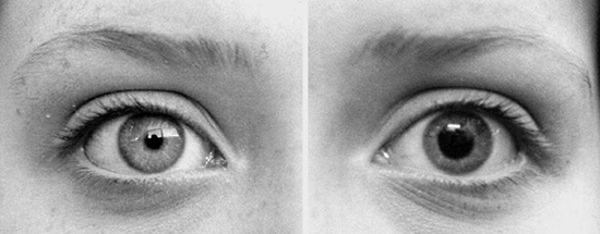
Cognitive load has visible effects on the human body and dilation of the eye’s pupil is one of them. By precisely measuring dilation, you get a relative measure of cognitive load. That’s great news, because our eye trackers collect that data by default. It’s just a matter of using it. Who wouldn’t want to know what part of their website is hard to use?
We’ve used this methodology in a couple of usability testing projects recently and results have been very positive. Results are entirely consistent with those obtained through other methods. Let’s take a recent project of ours as an example. The website in question was an ecommerce website with a time limit on the purchase process. We saw that the average pupil dilation of our participating users when looking at the homepage carousel was 3.1 mm and was 4.6 mm when looking at the timer in the purchase process. That’s a huge difference! It shows that cognitive load was much higher during the purchase process, which makes a lot of sense. Now, variations in pupil dilation aren’t always that pronounced, but they’re always a useful tool for usability testing.
A Few Tricks to Reduce Cognitive Load
As you know, our brain’s ability to treat information is limited. Minimizing the amount of information that our users need to deal with is part of our job as user experience professionals. To help us, NNGroup recommends three ways of reducing load.
1. Reduce visual clutter
Unnecessary content slows users down – remove it. Also, don’t forget that blank spaces play an important role. Use them!
2. Rely on existing models known to users
Users have already established habits which make websites easier to use. By moving away from those conventions, we run the risk of giving our users a hard time. Be safe and use existing models.
3. Simplify tasks
Every time a user must rely on memory, read text or take a decision, cognitive load increases. Locate those instances and find an alternative, such as turning a large paragraph into an image.
Those simple tricks will help you build a simpler website. For more advanced work, give the tracking of pupil dilation a shot!
Source: Jung, Jessica, Andreas Maier, Anne Gross, Natalie Ruiz, Fang Chen, Bo Yin. “Investigating the effect of cognitive load on UX : a driving study” , AutomotiveUI’11, November 29th to December 2nd, 2011, Austria.


