Improving Educational Applications for Children Through Usability Testing
In 2016, we worked with Houghton Mifflin Harcourt (HMH), a global learning company, to conduct usability tests in Texas, USA. HMH specializes in educational content, services and cutting edge technology solutions for children. The company serves more than 50 million students in over 150 countries. For this project, we adapted our usual approach of usability testing. Our first challenge was working with very specific users, children. The second was that tests took place in Texas, far from our Canadian facilities. Ultimately, we analyzed the recordings in Montreal to provide actionable recommendations while HMH designed, moderated and recorded the tests in Texas. We combined our expertise in user experience with HMH’s expertise in providing quality educational tools to help children achieve great results. Here is how the project went and what we found out…
Objectives
Tests had very distinctive objectives. In fact, two prototypes were tested: an reader with advanced functionalities and a reading activity application. User autonomy was a key element to test for both applications. We had to make sure children would be able to use those applications by themselves, or with minimal assistance from their teacher.
- An e-reader is an application to read books and navigate through content on tablet or computer. With usability testing, we looked if children were able to easily navigate through content and understand the interface (e.g., buttons). We also wanted to know about their global experience.
- The reading activity application we tested contained a book for children to read and questions to answer with the help of fun cartoon characters. Here, we went deeper than basic navigation. Our main objective was to test how the activity flow went for children from reading the book, to collecting evidence in the text, and eventually answering questions. Again, we were interested in discussing global experience.
Procedure
Conducting Tests
In July 2016, HMH designed and moderated seven usability tests with 8 year-olds in Texas. Choosing participants in the middle of the targeted age range facilitates result generalization by acting as a reference point. We can assume younger children will need a more assistance and older children will need less.
Usability tests with children differ from tests with adults. They need to be adapted to make users feel comfortable and thus ensure rich results. HMH followed guidelines to make sure children were able to freely communicate their impressions. Moderators took time to establish a relationship with each participant when they met and allowed time for breaks (play, snack, etc.). Throughout the tests, they motivated children by emphasizing the importance of their role and offered positive feedback by underlining how helpful their comments were.
Analyzing Results
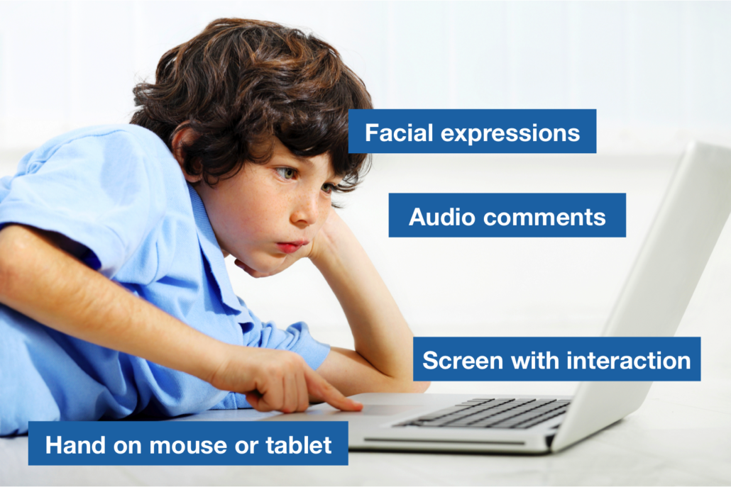
After tests were completed, HMH shared recordings for us to analyze and provide recommendations to improve both applications. We could see participants’ screen with interaction, hands on mouse or tablet and facial expressions in addition to audio comments. Behavioral observations are especially relevant when testing with children. In fact, they often are more reliable than verbal response to questions about whether or not they like something, particularly with younger children (Hanna and al., 1997).
Among the seven recordings, we selected six for analysis. For the e-reader part of the test, participants did similar tasks on desktop and tablet in a different order. We wanted to make sure we analyzed an equal number of participants using desktop or tablet first. We also chose participants according to attention. In other words, they needed to be attentive enough to provide valuable feedback on their experience. When time and budget allow it, backups are always a good idea in usability testing to prevent no-shows and replace inadequate participants if needed!
Results
Reports with Results and Recommendations
As we do in typical projects where we design, moderate and analyze tests, we delivered analysis and recommendations with different levels of priority. In this case, we provided HMH with two reports that were presented separately: one for each application. Considering different teams were responsible for each application, we communicate only relevant insights to each team.
Key Takeaways: User Experience for Children
Tests conducted by HMH lead to general good practices applicable to different kinds of interfaces and software for children. Based on the recommendations we made, we can to share a few key takeaways to help improve user experience for younger users.
To enhance navigation and guide users as much as possible…
- Use visual cues to ensure children know where they are in the application (e.g., breadcrumbs). Think of it as a road that needs clear signs and indications.
- Maximize visibility of feedback. Children tend to be less attentive than adults. If they interact with something on the interface, make it obvious so they notice it (e.g., contrasting color). Fine lines won’t do it.
- Integrate tutorials on first use to help children learn about the application. Once children begin to use an application, we can expect a learning curve. It will get easier but they need to figure it out first!
- Hide irrelevant content so users can focus on a specific element without being distracted (e.g., text, chapter, image, question to answer, etc.).
- Use icons that are meaningful to young users. Think about the social media icon with three dots. It is clear for most adults but is it visually relevant for children?
To improve the flow of an activity…
- Remove all unnecessary steps or information to prevent confusion. Less is more.
- Associate each desired action with a verb when giving instructions. Do you want users to read a text and answer questions or read a text, collect evidence in the text and answer questions? Make it as straightforward and sequential as possible.
- Make instructions visible or accessible at all times. Young users might quickly forget a question after reading it and get lost in the activity.
- Provide contextual help so users can turn to it when they get stuck.
- Make buttons as clear as possible textually and visually. For children, labels such as “I’m done!” might be more relevant than “Validate”. When possible, add icons. For example, we could include a checkmark icon in that case.
Those good practices should be applied to most children interfaces and software. That being said, it is important to adapt them to each specific situation. Usability testing is especially important when it comes to young users. As designers, it can be hard to understand a user’s point of view. As designers and adults, research becomes essential to understand what it is like to be an 8 year-old user. The best way to fulfill users’ needs is to ask them what they think!
Collaborating for Better User Experience
Thinking about usability testing? imarklab can assist you though the whole process: defining objectives, test design, recruitment of participants, moderation, analysis and recommendations. As our collaboration with HMH demonstrates, we can also adapt our approach to fit your needs. Do you want to conduct tests yourself but have us analyze them afterwards? Would like to recruit your own clients, prepare a scenario but have us design and moderate tests? Everything is possible depending on your situation.
Contact us to discuss usability testing and see how we can accommodate you!
Source: Hanna, L., Risden, K. and K. Alexander (1997). “Guidelines for Usability Testing with Children”, Interactions, vol. 4, no 5 (September + October), p. 9-14.


