Eye Tracking Study at the SAQ: Grab Consumers’ Attention Online vs. In-Store
Last December, we used mobile eye tracking to identify good practices to grab consumers’ attention in an SAQ store. We worked with SAQ and OPTECH to see what grabs clients’ attention in the aisles and how product positioning impacts choice. Our study also had an online portion where we asked consumers to select the same products on SAQ’s online store. In this post, we will focus on online shopping experience based on results from the Web portion of our study. Our objective: find what grabs consumers’ attention online and how online and in-store experiences compare.
Target Clients, Scenario and Technology
We published our previous post a few months ago, so let’s get back into it (in case you missed it, it’s here). We invited six Millennials at the SAQ location next to Montreal’s Atwater Market. Each had to choose two specific products (Pineau des Charentes, Prosecco) and two others of their choosing (aperitif or desert wine, sparkling wine). Participants wore eye tracking glasses while shopping in-store and online. We tracked their gaze throughout the process. Half of participants shopped online first while the other half began in-store. We proceeded this way to avoid order bias.
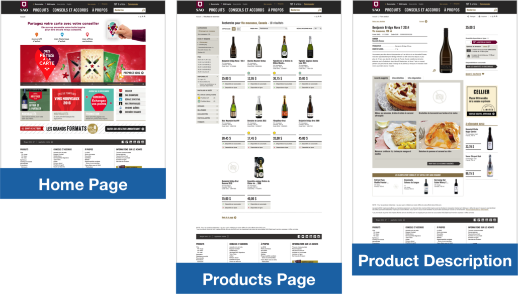
In-store, we were interested in client first impressions at the entrance and in two specific sections: aperitifs and desert wines as well as sparkling wines. Online, we looked at three pages: home page, products page and product description page. We created equivalent scenarios in-store and online. As it is the case with the store entrance, the home page tells us what users first look at. Products page is similar to what we see in-store on the shelves. Product description page is a bit more distinctive. It is a combination of a product’s label, indications on the shelf (e.g., taste tag) and information SAQ’s advisors can provide. We will see how we can compare all of this…
In the online portion of our study, we analyzed eye tracking data based on a “standard” template for each page. Even if participants saw different products pages (different filters, etc.), results were compiled to represent the average gaze path on products pages. The same goes for product description pages. We were interested in what participants looked at rather than what it precisely contained (e.g., product image vs. label color). This gives a better overview of consumers’ behavior.
Home Page: Straight to the Point
What is the first impression when clients arrive on SAQ’s website? On the home page, what do they look at before clicking?
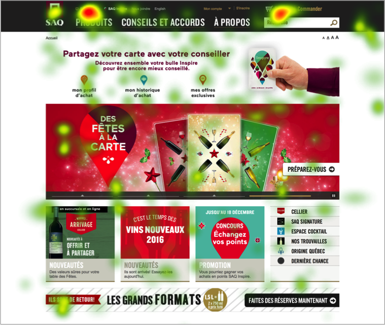
When they started shopping, participants looked at featured items on the home page. Afterward, they used the main menu or the search bar to find the products they were looking for. This behavior is similar to what they did in-store. At the store’s entrance, participants looked at a shelf with featured products briefly and moved their gaze to the signs that identify store sections. Online, their gaze quickly went to the “Products” section of the main menu or the search bar. This is why these two areas are red on the heat map below. Red areas were looked at the longest followed by yellow and green:
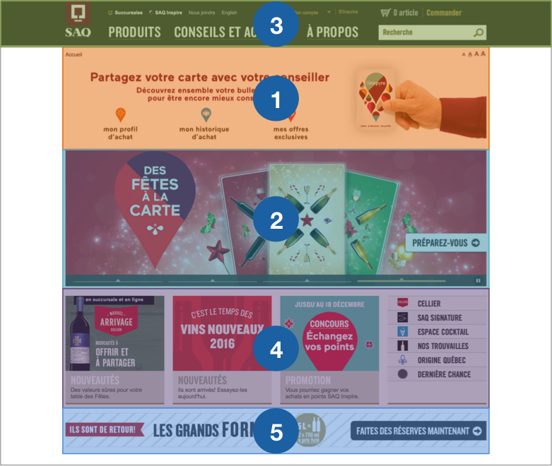
The carousel slider and main menu were the second and third elements to be seen but still caught users’ attention for the most time. Participants looked at these areas for an average of 3,9 and 3,1 seconds respectively. The Inspire banner also caught participants’ attention. It is the first thing they noticed on the home page. They looked at it for 2,6 seconds. Fourth, participants saw new products and promotions. They looked at this area for an average of 2,1 seconds. Fifth, they noticed the banner under new products and promotions. They did not pay much attention to it compared to other elements (0,9 seconds). Areas of interest on the home page were given a number on the heat map and table below based on average order in which participants saw them:
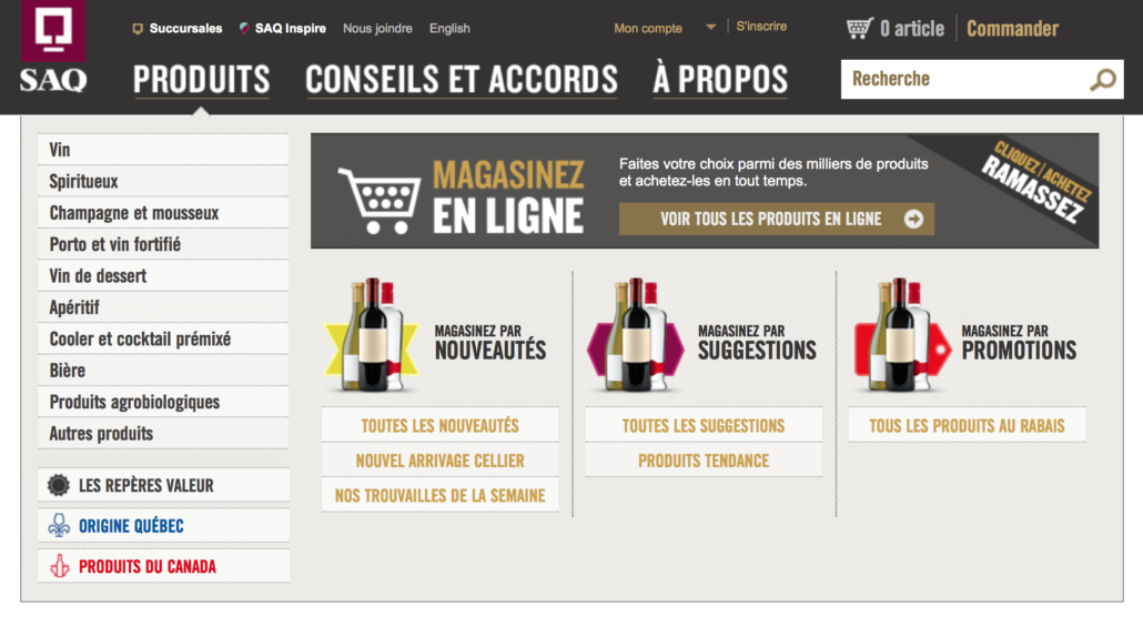
As with shelves located at the store’s entrance, the carousel slider and the top banner are effective to grab clients’ attention when they arrive on the site. In-store, participants looked at the signs near the ceiling that identify sections to figure out where to go. On the website, they paid attention to the main menu. This behavior is common online because users usually have a task in mind when they visit a website. As such, they do not spend much time on the home page. The SAQ understood this well and uses the main menu to promote products. Our study shows that the SAQ should keep using the main menu to grab users’ attention even if they go “straight to the point”.
Products Page: To Get an Overview
On products pages, which positioning and elements grab consumers’ attention? Encourage them to click on a product?
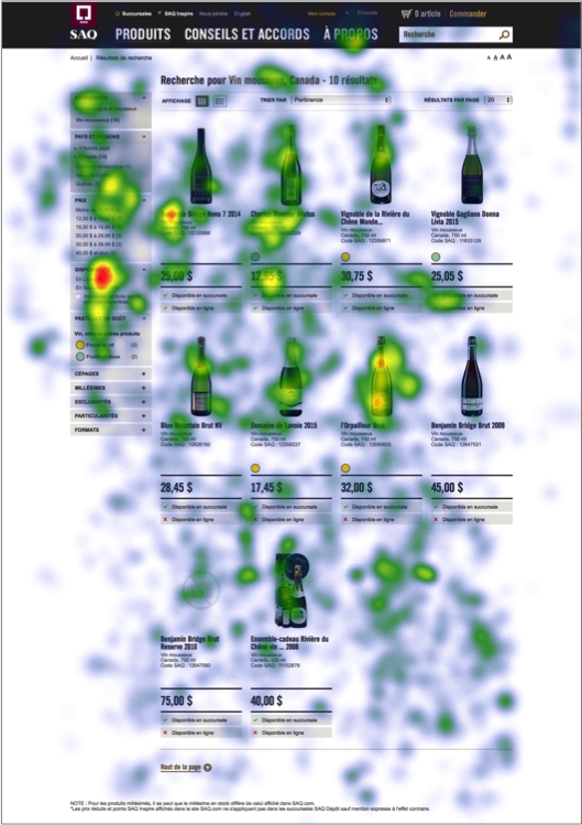
Participants spent a lot of time looking at the products shown in rows and search filters on products pages: 124,1 and 23,5 seconds respectively. All used or referred to search filters to find the products they needed (e.g., sparkling wine). The heat map below indicates that participants spent more time looking at products on the left part of the page. This makes sense considering most participants used the filters. Also, the gaze path usually goes from left to right. As consumers are getting used to scroll on mobile devices, they tend to browse web pages from top to bottom. They pay less attention at what is located at the right of the page than they used to:
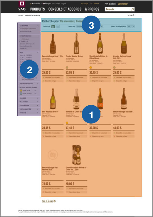
Products first caught participants’ attention when they landed on products pages. Afterward, their gaze moved to the search filters and details about the results. They spent an average of 6,8 seconds looking at this zone. By analyzing participants’ navigation, we noticed they referred to these details to ensure they were looking at the right products.
Through the whole search process, products on the products pages were the elements looked at the longest: more than 2 minutes on average. Only basic information about the products is presented on these pages. Participants took their time to choose which bottle to click on, similarly to what they did in-store. When shopping in the aisles, they browsed the shelves carefully before picking a bottle and looking at the label. Based on these observations, we see that the way a product stands out (e.g., bottle shape) among others can impact purchase decisions both offline and online.
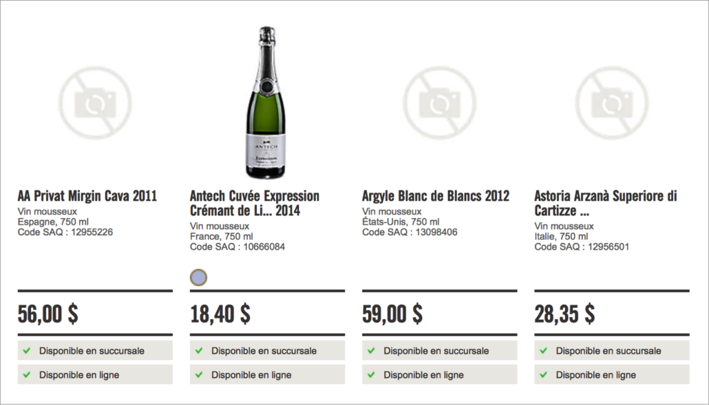
On the SAQ’s website, some products do not have a picture. Participants were free to choose those, but in fact only chose products with pictures. Missing visuals might not bother wine connoisseurs searching for a rare bottle. However, pictures are essential to Millennials. To grab these clients’ attention, the SAQ would benefit from adding pictures for as much products as possible.
Product Description Page: To See Details
What do clients look at on a product description page? What grabs their attention when they make a purchase decision?
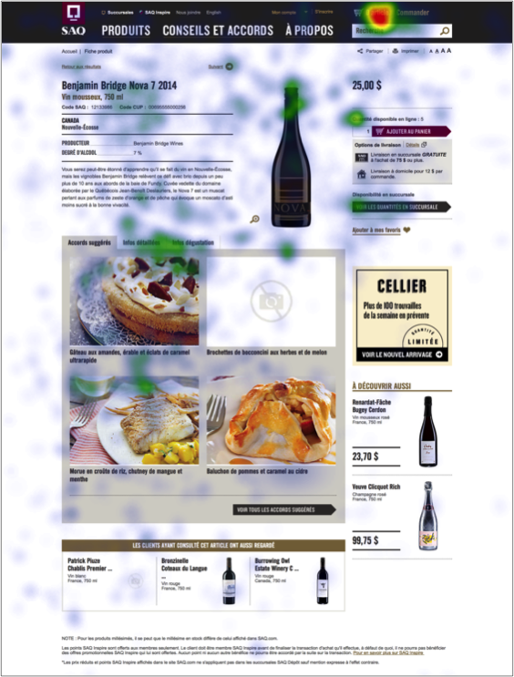
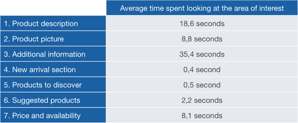
We could easily presume that the picture and description are the most important elements in guiding a purchase decision on a product description page. Surprisingly, these elements are not what most caught our participants’ attention. They spent an average of 18,6 seconds looking at the description, 8,8 seconds looking at the picture, and 35,4 seconds going through the additional information. This means that suggested pairings, detailed info and tasting info kept participants’ attention almost twice as long as the product description. On the heap map below, we notice green fixations on the additional information. This heatmap is not as colourful as the others because participants spent less time on product description pages than products pages:
What about the red dot in the upper right corner by the search bar? Participants were asked to add four products to their cart so we expected a lot of fixations there. Every time they clicked on “Add to cart”, a window opened automatically under the cart icon:
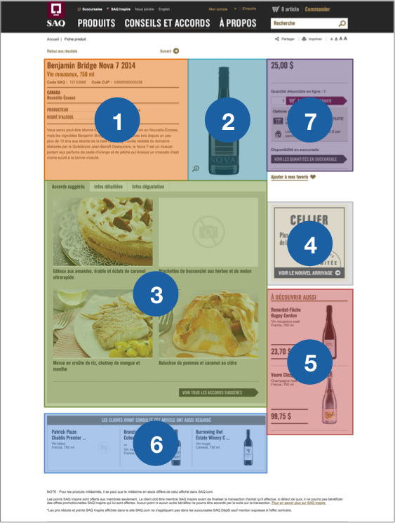
And the gaze path? When they arrived on a product description page, participants looked at the product description (1) and picture (2) first and almost simultaneously. They browsed the page quickly before paying attention to the additional information (3). Next, they glanced at the new arrival section (4), products to discover (5) and suggested products (6). They spent less than 1 second looking at the new arrival section (4) and products to discover (5) but looked at suggested products (6) for 2,2 seconds on average. This last section is less likely to be ignored because it is located under the content rather than in the right side of the page. Most Internet users got used to ignoring ads located in the right part of their screen (banner blindness).
The last thing our participants looked at before adding a product to cart is information on price and availability (7). They spent an average of 8,3 seconds looking at this element on the page. At this point, they had chosen the product on a products page and already knew its price. Product description and additional information are the elements that played a key role in their decision. Additional information is especially relevant to Millennials who are still learning about wines and spirits. Our study showed that adding additional information about products such as suggested pairings, detailed info and tasting info is beneficial for the SAQ.
Online vs. In-Store Experience
We compared the Web and in-store portions of our study during our analysis. It showed that consumers behave similarly online and offline. When they started shopping, participants went straight to the products they were looking for, both online and offline. This explains why they did not spend a lot of time on the home page and at the store’s entrance. Choosing products on products pages or on shelves was the longest step of their shopping process. It was a bit shorter online than in-store (154,4 seconds vs. 198,4 seconds). We should note that participants could access product description pages online which helped in their decision process. The average time spent looking at SAQ’s website pages and store sections are summarized in the table below:
Online, participants liked having a large selection of products to choose from and having access to detailed information about each. Making it easy for clients to access information and a full selection of products in-store through mobility or interactive screens would bring the benefits of online shopping offline.
Offline, participants liked being able to hold the bottle in their hands. Allowing clients to see all angles of products online, or see them in 3D, would bring the benefits of offline shopping online.
5 Good Practices for SAQ
Our questions were: What grabs clients’ attention online and how can we compare online and in-store experiences? We answered it using mobile eye tracking. As we did for the in-store portion of our study, we summarized our key findings in 5 good practices to improve online experience and provide a seamless omnichannel experience:
- Use the main menu to grab clients’ attention. For example, add different weekly promotions next to the website’s sections.
- Add images for all or most of the products available online so they can all grab clients’ attention on products pages.
- Provide detailed additional information for all products (suggested pairings, suggested cocktails, tasting info, etc.).
- Make it easy for clients to access additional information in-store using their smartphone or interactive screens in the aisles.
- Allow clients to see all angles of products online. For example, add images to showing different angles or add a 360º product viewer.
Again, these good practices are specific to our study but can be applied to other e-commerce websites. They reinforce a dominant trend in retail: boundaries between online and offline shopping are blurring. In 2017, consumers are more empowered than ever. They want it all. They expect all the benefits of online shopping in-store, and vice versa. Studies like this are certainly one of the best ways to learn about contrasts between consumers’ experience online and in-store!
In the Web portion of this study, we wanted a global overview of the shopping experience on the SAQ’s website. We could also take a more specific approach. For example, it would be interesting to see which products are the most likely to grab consumers’ attention based on their visual characteristics. We could also have participants look at the same product description page. Flexibility is one of the main strengths of eye tracking. It allows us to answer all kinds of research questions.
Are you curious about mobile eye tracking? Do you think it can be useful for you? Contact us or subscribe to our newsletter for more studies like this one!
***
We would like to thank Catherine Dagenais and Lilli Prud’homme from SAQ for allowing us to go forward with this study, Benoît Cusson and Roberto Ciocca from the Atwater Market SAQ store who collaborated with us. This project would not have been possible without the precious collaboration of OPTECH who lent us their eye tracking glasses. We would like to thank Maroun Massabki, Director of Development and Innovation, and Bruno Santerre, Communications Teacher, for their support and enthusiasm. Finally, we want to mention contributions of Florian Cruzille, student in journalism in charge of documenting our study, and Julien Colimon, Optical Technician at OPTECH.

