6 Principles to Understand Card Sorting and Tree Testing
First, let’s define the two methodologies:
Card sorting: research methodology used to better understand how users group concepts by having them sort, categorize and group cards on which are written information describing an interface’s contents.
Tree testing: research methodology used to test a given architecture by having users complete tasks through navigation in a menu structure
Now, let’s move on to 6 simple principles that will help aspiring usability experts better understand those two very useful methodologies.
1st principle: Information architecture is the foundation of a web site or mobile app.
Information architecture is basically the way information is grouped on a website. In other words, information architecture is a website’s skeleton. With a good architecture, users can quickly and efficiently find what they’re looking for, even when the website has a lot of content. Card sorting and tree testing are used to design that architecture.
2nd principle: When building your information architecture, you must involve end users.
Typically, you’ll be working on information architecture when building from scratch or redesigning an existing website. You must involve end users. It’s a mistake to think content can be organized based solely on an internal perspective. Users speak their own language, which is likely different to the one in use in your organization. After all, users don’t know your business as well as you do.
Let’s take the example of a sports amphitheater’s website. From an employee’s perspective, it might be entirely logical to find restaurants under “concessions”. I bet that’s not the case for sports fans, who will be looking for something like “restaurants” or “food”. As such, you don’t involve the user in building the website, you’ll end up with something they can’t efficiently use.
Fortunately, information architecture is not something you change on a daily basis. As such, you can afford to reach out to users when you do. In short, involve users to:
a) build a website structure that reflects the way users understand and view your content.
b) make sure you are using the user’s language.
3rd principle: 10 participants for in-person card sorting and 20 participants for remote card sorting and tree testing.
For card sorting, plan for at least 10 participants if meeting in person. If you’re carrying the activity online, aim for 20 participants. Keep in mind that only in-person will provide you with reliable qualitative comments. You’ll want to have more participants when going online to compensate for that lack of qualitative data. Fortunately, online testing is much cheaper per participant.
4th principle: Card Sorting is a 3 Steps Process.
1. Defining content
This step is done before you meet with users. It consists in listing the website’s contents and putting it down on cards. Those cards can be virtual in the case of an online card sort or real paper cards if in-person. Don’t use too many cards or else it will turn into a puzzle for the user. We typically stick with a maximum of 30 cards.
2. Grouping content
At this stage, we hand the cards to our users and ask them to group them in the way that is most logical in their opinion.
There can be two slightly different types of card sort. The first is called “open”, where users create and name the group categories into which they put each cards. The other one is “closed” where categories are already provided to the users. Closed card-sort is the most widely spread because it allows for an easier comparison between users. As a compromise, we often allow users to create new categories alongside those already provided.
3. Structuring content
At this point, users define the relationships they believe should exist between each groups.
5th principle: card sorting is exploratory and tree testing is confirmatory.
Card sorting imposes fewer limitations on the participants compared to tree testing. As such, you can go into the detail of how users think and understand your content. That’s why card sorting usually comes before tree testing in any information architecture project.
6th principle: results of the card sort are used to prepare tree testing.
A card sort activity will inevitably highlight difficulties in classifying or grouping content. You will then try to build the architecture that best addresses those difficulties. That architecture should then be tested to ensure the changes do solve the problems. That’s where tree testing is most useful, because it exposes users to an actual menu structure through an online tool.
During tree testing, users are asked how they would complete a given task using that menu structure. By monitoring metrics such as success rate and time to completion, you can assess if the new architecture is indeed easier to navigate.
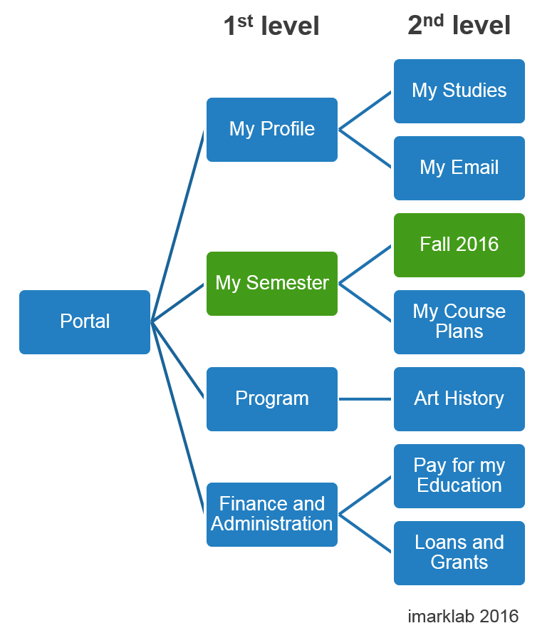
For example, consider this task: “You wish to cancel one of your college courses this semester. Where would you go to complete this task?” In the following structure, users would choose one level at a time where they would expect to find the information needed to complete the task.
Results will show if the proposed architecture is easy to use and intuitive for users without relying only on the organization’s internal perspective.
In the end, an information architecture built through card sorting and tree testing will be based on objective user data, not the organization’s internal perspective. This goes a long way in providing a website or app that is easy to use and where users can quickly find what they are looking for.


